Agnes Martin- Tate Modern, London

In my blog Dia, I wrote about my new art loves, Agnes Martin and Fred Sandbach/Sandback. But Dia is near New York City, about 40 minutes on the train north, along the Hudson and I am not there!

The show at the Tate features works that were not at Dia. It is a bit of a retrospective, so Martin’s early works are shown. And then, like I said in Piet Mondrian at Margate blog, you suddenly walk into a room that are Martins. The full, realised art.

Each work is in the same square dimension, very unusual as most paintings are landscape or portrait; rectangles of containment rather than squares. They are works of art. Not about art. Not about something. Just the thing itself.

Agnes Martin retrospective at Tate Modern, 3 June – 11 October 2015

And then the room I could live in. Twelve mainly white paintings, like twelve tribes. Each different, each individual. Barely there yet containing everything.

Sublime.


Advertisement

Cote d’Azur


St Paul de Vence

We are just back from a 5 day trip to the South of France courtesy of some very generous hosts who gave us accommodation, food, company and treats- taking us around. It was an art tour. I am not great at holidays. It takes me a while to work it out, so having a focus: art, gardens, wine or whatever, makes it easier to relax and enjoy. As art is one of our loves we were lucky that it was shared on this trip.

Fondation Maeght in St Paul de Vence is architecturally worth a visit. Coupled to this are some stunning art in the permanent collection including works by Calder and Caro and a beautiful painting by Bonnard and Braque, currently on display. There are also a courtyard full of Giacometti and a courtyard of Miro. The current exhibition is not my thing at all so I won’t mention the name of the artist!

Fondation Maeght


The Matisse Chapel in Vence is so wonderful and we were lucky to time our visit with a brief, clear and excellent talk in English about its history and meaning. The colours that he selected and the work and method of making it were also explained, but really succinctly. This is his last major work before he died and he said ‘I was born irreligious and I am finishing divine’! Beautiful, meaningful and spiritual. What more can you ask from art?

Matisse Chapel, Vence


The Picasso Museum in Antibes is also a must. If you only see one work, the Ulysses and the Sirens piece is worth the visit. The whole place is full of his brilliance and also lots of photos of him and his wife which are full of life too. The place is set by the sea so the views are wonderful and the building is beautiful. The interiors are over- restored which is a shame, but still what a setting and what wonderful  works.

Image result for picasso ulysse et les sirènes     Picasso

There was also an exhibition on of a husband and wife artist. His name was Hans Hartung, but it was his wife’s work Anna-Eva Bergman (originally from Norway) that was wonderful. I had never heard of her before and I am now a great fan.

Anna-Eva Bergman


There was also a fabulous film by Iris Sarah Schiller ‘The Hair of my Mother’ made in 2003, which we sat and watched. Simple and very profound.

We also liked one work by Pierrette Bloch (1975) which looked a bit like tiny dots of code.


In Nice we were taken to Villa Arson. The current exhibition has some good works in and the film by Ben was very worth the trip. We did not have time to visit the student show which was a shame.

We also were taken to a concert of Celtic music played in a monastery in the hills of Nice,  performed by the legendary Jordi Savall. Wow!

And a dinner at the Colombe d’Or, where you can skip the food for the art on the walls.

Finally, we also went to La Station in Nice where there is an exhibition on Australian art. Some very good pieces. But the really great part of our visit there was that Le Station also contains artists studios and by sheer chance we met Jean-Baptiste Ganne. What joy to discuss his works and what wonderful works. His Morse code version of Don Quixote, which he has shown in many places, was brilliant. He tried to show us his new work, but there was a temporary electronic problem so we went off to look at other work. I came by just as it was working so I got a solo show. A round curvaceous lamp lights up (lamp is feminine in French) and a man’s voice says ‘Look at me’ and other messages. Wonderful. All art needs to be looked at. The viewer completes the picture. It was funny, poignant, profound and simple. It goes on show in Switzerland with one part of the audio saying ‘huh, I thought I was going to be shown in Basle and I end up here’. Every artist will understand. Lovely. Thank you very much Mr Ganne.

I did not know so much great work and so many great places existed in the Cote d’Azur.  Thank you very much to our wonderful hosts; true gems.

Turner Prize – where did all the art go?

The Turner Prize, named after the wonderful artist, is an annual award given to a British Artist, or an artist who works in Britain. It is usually a very big deal to get one and just as big a deal to be nominated for one.

This year, however, it all changed. I don’t know if the committee for this year’s prize are so inexperienced they needed our help or if they think that inclusivity is the same as amateur, but they opened the nominations up to the public. This sounds like a great idea, we get to say who we think is great, but of course an expert panel decides.

I am not against expertise. In fact, I am really in favour of it.  I want any operation I need done by an expert in the field rather than a member of the general public. I don’t even mind elitism. I would not watch a 100 metre final with my neighbour running in it, but I would watch it with an elite athlete.  I don’t know why you are not allowed to be an expert or among the elite in other areas such as art or science. I have no problem with it. I am not talking about exclusivity, where you are excluded from participating. I am talking about the best winning the prize.

Now, I think if you ask the public to nominate we should see the list that we nominated and the votes, otherwise why bother asking us? I don’t mind an expert panel making the final short-list otherwise what is the point of excellence? But I do mind being asked to participate and then not knowing what happened. The Tate has no ‘long’ list. I think that some of us public may have nominated artists, rather than amateurs. I want to see.

What they do have is the usual short list of four contestants. I say the usual short list as it is not the usual short list at all. Most of the list does not comprise artists. There are community groups and gardening designers. Now we have just had the Chelsea Flower Show in London and there are many other such shows for gardeners. I do not think that designers need another forum when there are so few art forums.

There is one obscure art work which perhaps nobody saw that has been nominated, but the rest are not by artists. They are pretending to be inclusive, but that is not what I want. I want excellence, innovation, ideas, creativity, spiritual uplift, art, something. I don’t want a community project or a mural  by some school children nor do I want a designer.

At least this year it is being held in Scotland and as so many of us are furious with the Scots for bringing in this government and having 56 seats for a nationalistic group many of us, I hope, won’t bother to take any notice of it.

But please Tate, next year, get a panel of experts in art and get an artists only list. Art is something done by artists, just like science is done by scientists. If you don’t know that, get someone that does and stop wasting this moment to promote artists, a sorely needed moment for most artists in Britain given the punitive funding cuts to the arts. This should have been their moment. The designers and community workers have lots of places to go, just like the amateur actors, I’m sure their friends and family love them, but please can we bring back art to the Turner prize, an exclusively art prize?

If the committee don’t know what that is then sack the committee.

Thomas Struth- Is art objective?

Thomas Struth is a famous German art photographer. I say art photographer as his photographs look documentary, but they are not. But then I am not sure what documentary is either. Being a scientist I do not believe in a neutral observer, so I am not sure about documentary work. Perhaps Google Earth is objective.

Thomas Struth

Struth has recently completed some photographic series in Israel and some of them are on show at the Marion Goodman Gallery in London. Last night, Tuesday, the artist was also present for an artists talk, so I went along. I did not really know his work so I came to it with little idea.

At first I did not like them much. I had been told that he does not take a point of view (political) merely capturing what he sees. I did not believe this as everybody has a point of view, they like something, they don’t like something. In his talk he contradicted this assumption that is held by curators and others and said of course you make choices, you choose what to photograph, what angle to use, when to take it as the light plays a big part in telling the picture. He was a very good speaker. I still was not sure about the photographs, though. I thought they were very editorial, very opinionated. But in the night I thought about them some more.

They have a great space to them, they spill out into the room as if you are part of them. He said that he had become a photographer because he did not have the patience to paint. But his images look like they have taken ages to photograph, as if he stood there for months with the shutter open, even though it is obvious he didn’t- they are all crisp and clear and of one moment. But they have a stillness about them, an absence, maybe.

I still think they are a point of view, his and therefore and imbued with his beliefs and history. You cannot fail to bring yourself to your work. The photos of interiors and the ones of machinery or laboratories did not hold me. But, I found a great beauty in the landscape photographs. They had a classism about them. A greatness of view. Definitely not objective; very subjective, selected, edited, his view. But how could it be otherwise?

Worth a trip.

Venice Biennale 2015

Venice.  La Serenissima. A city so beautiful that adding art to it may seem superfluous. But here comes the Venice Biennale. Lots to see on such a stunning backdrop;  quite a competition for your attention. However, the Venice Biennale is now at it’s 56th show and has therefore had about 112 years of practice of attention grabbing art.

So here is my view:

1)  The Pavilions in the  Giardini

Many nations have pavilions that they pay for and then select curators or artists to fill with works, some are themed and some are Art!

But the British are coming, the British are coming.

Well the English are, as I have rather gone off the Scots since the election.

In the British pavilion Sarah Lucas turned up the volume in many senses. Her pavilion was a huge colour field in yellow and at the inauguration, instead of another bunch of long, boring speeches, she had two brilliant musicians pump up the volume and rock it. Fab.


Sarah Lucas  Venice 2015

The USA pavilion had the fantastic Joan Jonas, I am a big fan and it was great to see a long line of people waiting to get in to such a totally and completely conceived and realised show,


Image result for joan jonas venice 2015

Joan Jonas Venice 2015

The Belgian pavilion had some great stuff; one of my favourite pavilions. Merged art and ideas.

The Danish pavilion was spare and lovely.

There is also a Giardini group show which had some great works including the excellent Jeremy Deller being very political.

2 In the Arsanale

Then over to the Arsanale. This is a huge place with many artists being chosen from around the world by the curator of the event, which changes each time.

The theme of the show this time was based on Paul Klee’s Angel of History painting and Gershom Sholem’s poem (who they managed to call Gerhardt Sholem !). But this theme been done before in 2006 at the Arnolfini’s opening show, which is a bit naughty.

But some brilliant work:

Adel Abdessad with a fabulous performance piece and the result of the work.

Daniel Boyd aboriginal painting

Sonia Boyd with a film of a performance at the Victoria and Albert Museum in London which was so alive, current, engaging and modern but with undercurrents of identity and politics. Great stuff.

Theaster Gates film of the destruction of a church in Chicago. You needed to know the context to see it and then you can see the layers.

Steve McQueen’s film-great stuff. Great art.

Hiwa K from Iraq

Chris Ofili, wonderful paintings, especially the Green one. I walked in and almost out at first as they were very overwhelming. But when the room emptied I went back and fell in love. Not at all my taste, but I ended up just wanting to live in the room!  Total convert. Loved them.


Chris Ofili Venice 2015- this image doesn’t do it justice!

Christian Bottomski film of wheat sheaves and bells on the sea shore, really simple and really everything

Jumana Emil Abboudthe drawings, beautiful

Chantal Akerman film, which was fantastic as film and as installation. It made you walk among the screens and it was all sped up with a sort of road movie feel, but with no people, just landscape.  I loved it.

Some duds and lack of credits including a work called the Botany of Desire. Now I know the book of that title and the book is much better than the art work of the same name.

3 Then into the best in showsssss!

My favourites were not in the official biennale. They were in other galleries, or Palazzos, which are pretty amazing places to show art.

‘Slip of the Tongue’  with some brilliant pieces by Nairy Baghramian, Nancy Spero, Henrik Olesons (nails) and Petrit Halilay. Curated by Dan Vo who did the Danish pavilion too.

Jimmie Durham: this was almost best in show as I was totally absorbed and could have stayed all day/week. It is in a beautiful setting which helps, but he really used that and there is a wonderful book that accompanies the work- worth reading. The show is at the Fondazione Furla which is worth going to anyway, but with his work there, spend the day. Perfect use of some Morano glass.Really wonderful work

jimmie durham

Jimmie Durham

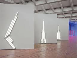
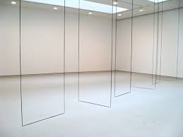
We were about to go back to visit the Jimmie Durham as it was so wonderful, but it was closed on the Monday so we went to the Fortuny Museum instead to see a show there, Pro Portio. What a place and what a show . Some amazing works including Marina Abramovich (sound work), Sol le Witt, Agnes Martin, Carl Andre and Fred Sandback, juxtaposed with the odd Botticelli and Durher anatomy books! Wow, The Italians are not precious about their wonderful art collections. Totally wonderful show and place. Brilliant curation. I could live there too! So it ended getting my Best in Show (a bit like Crufts I guess). I loved all the juxtapositions of ancient and modern at both this and the Jimmie Durham shows.

Ellsworth Kelly Red, Yellow, Blue, 1963 Olio su tela, 231 x 231 cm Collection, Fondation Marguerite et Aimé Maeght, Sant Paul-de-Vence Cliché Claude Germain, ©Ellsworth kelly

Ellsworth Kelly “Red, Yellow, Blue”, 1963, Collection, Fondation Marguerite et Aimé Maeght, Sant Paul-de-Vence Cliché Claude Germain, ©Ellsworth kelly-  at the Pro Portio show 2015 Venice


Sandro Botticelli (Firenze, 1444-1510) "Ritratto di donna", 1485, Tempera su legno 61,3 x 40,5 cm Private Collection, Bruxelles

Sandro Botticelli, “Ritratto di donna”, 1485, Private Collection, Bruxelles – also at Pro Portio Show 2015 Venice!

Also, I should mention the ‘Venetian Blind’s, a series of concerts by bands led by artists in the amazing Palazzo Grassi  with free cocktails to cheer the spirits. Martin Creed played- I shall ignore the Scottish bit and claim him for good old Blighty! Fab.


Michal Rovner-Panorama. Pace Gallery, London

On the whole I don’t like Video Art. If I want a moving image I can watch TV or a film. I want a picture or an object that stays still for long enough for me to look at and engage with it.

So when a friend at a gallery opening said you must go up the road to Pace and see a show by a video artist I was in a mixed mind. The friend has a great eye so that sort of recommendation is to be taken seriously. So off we went.

Thank you friend!

These works are barely, but beautifully, video art. They look like landscape photographs and then you realise that the skinny little figures, reminiscent of a Lowry painting, are moving in a choreographed way. They appear almost to be dancing, performing a folk dance, and then again to be wandering. These moving human shapes evoke many possible lives,  migrants, guerrilla combatants, concentration camps prisoners, agricultural workers or the ghosts of previous lives. They appear as part of the landscape, coming out of the earth; Adam. They are us.

This is also seductive to look at and very high production values have gone into fabricating the work.

I didn’t know her work at all and as I said, video art tends not to be my thing, but this captivated me. We often elevate the individual as our heroes, but here the slightness of the figures in the landscape made then all the more human, all the more vulnerable, all the more noble, even as, perhaps, they, the figures, may represent the victims of mad ideas, mad people, mad regimes.

Collective lives, lonely lives, vibrant, sad; many ideas and emotions evoked by this beautifully thought through, beautifully crafted work. If this is video art I am now a convert.

Great stuff. Go see.


Bridget Smith- Focal Point Gallery, Essex

Wow.

We arrived in Southend to see this show a bit early giving us a chance to have a walk around the town. It is a bit like Folkestone in Kent, but this is in Essex, facing out to the estuary and the North Sea. Nice seafront, very 1950’s British.

The Focal Point Gallery is next to a couple of colleges so we thought that this would get some students in, but no, a whole load of people who looked like the Art Crowd, had come to see the show. A very large turn out of people.

No wonder.  I did not really know her work. Wow. What fabulous pieces. Smith has moved from more documentary works to more abstract works. From works with interesting objects to the objects as the subjects. Wow.

The first room had lights like globes and large blue works on aluminium, with the outline of what turned out to be cinema chairs in white, echoing seascapes. Here we were, audience and participators by our absence in the work, by our presence, viewing the work. This image is repeated in another room which contains a similar image, but on just one wall, on draped materials, partly like a curtain, a cinema curtain, and partly a tapestry draping down onto the floor. Where does the art stop and the observer begin? What is being observed, the cinema image or the art? I loved it.

Bridget_Smith-


And then, in a corridor facing the glass front of the building a series of Perspex works with a colour pattern engraved onto each piece and a hole in each through which a spotlight falls creating a contrasting colour shadow. Light and shade. Stunning stuff. Completely Original. An artist hits her stride. Confident, vibrant, forceful. Deceptively simple, but so much more, Intellectual, aesthetic, minimal.

Go see. Fabulous.


Art in Hospitals- curing the spirit

Le-Jardin-

                                                 Le Jardin hospitalier (2015)  by Jyll Bradley

                                               Hôpital Roger Salengro, CHRU, Lille, France

                                                                                  photo credit Maryline Migot.


I know that the main function of a hospital is to repair the damage. Usually they are good at repairing physical damage and sometimes they can point people to the place to help repair their mental health, even if they cannot repair it then and there. Hospitals tend to deal with acute problems, patching you up and sending you out. They cannot repair your life.

Hospitals want to be holistic, but seldom are. They cannot be all things to all people. But what they are is a place that anyone, the stranger, the excluded, can come in at any time of day or night. The door is always open. The word ‘hospital’ has the same root as hospitality. It is meant to be a place of care.

UK hospitals are usually extremely ugly. As I said in another blog, we do civilised care, but not cultural care. We don’t care beautifully. We don’t care for ourselves and others with due diligence, with real care and empathy, with respect and dignity. We treat our ill as bodies. You come in and surrender your bodies to the staff. We shove you into cramped cubicles, we put you in beds with scant curtains between them, we degrade the space and your space, your body, to a non-functional body in a bare, ugly, functional space.

In the UK, particularly in Accident and Emergency (A&E) or urgent care settings, people often behave badly towards staff. This is for a number of reasons such as being frightened about their health, scared that they or a relative are going to die or, the most common reason, being high on alcohol or drugs. But people also behave badly in ugly places. Beautiful places lift the spirit and speak to a higher emotion than the instant physical fear.

So then we put ‘Art’ into hospitals. Childish, primary colours, bright and ‘cheerful’ that are so depressing and sentimental, infantilising and childish. We say we could not spend money on good art as the priority is to spend money on medicines and technology. Why is it either/or? Why not both. Beautiful places make you feel better and behave better and painting a wall in an ugly colour costs the same as in a beautiful colour.

In France they take a different view. On a corridor that is used by 3000 people walking along it each day, a depressing, soulless, windowless place to literally lose yourself and your directions, in a hospital with very depressed staff going up and down this corridor, they took a huge budget (in fact about double what it would cost to refurbish with horrible paint, lights and flooring) and commissioned art.

They got smart. They chose an art production company: artconnexion that really get art, rather than slickness or merely production. Artconnexion were very brave, they chose a British Artist, Jyll Bradley, who makes architectural structures and installations.This is not sentimental or infantilising. The hospital staff, doctors, nurses, administrators, porters, chefs and patients also got brave. They went with it.  The result is mind blowing.

This is not sentimental. This is not false cheer. This is visceral. This is the blood and guts and care and beauty that is us. This is nature and nurture.

Jyll Bradley has made other work, architectural art installations, particularly site specific work,  and interacts with the place in all its aspects discovering things that are unknown or forgotten. The corridor reflects the history of Lille, the town where the hospital is, with its large botanic and herbal medicinal history. A corridor with no windows and an artist who understands and works with light, that basic need for plants to grow and therefore for us to thrive. Back-lit images like stained glass windows, but also like windows onto a world, the world of the gardener, who tends the plants, revealing parts of the plant: the flower, the bulb, like an operating table; the water and earth that feeds the plants like a nurse tending a patient; where you enter, remove your outer clothes and put on your apron to avoid the visceral mud, blood, cells, getting onto your outer clothes. This cross-reference. This beauty. Put together with extreme care. The installation. The wall colours. The flooring. Extreme care. In a place that cares about its corridors,  where the artist has made a corridor look like a walk through a forest, that has ‘la source’,  an area where you can sit and read, which looks like you are in a tree-house, a wood, back in nature, that brings such care to place,  nurture. How much more so that you will be cared for as the patient, the family, the staff?

Care, being careful, really caring rather than careless; providing beauty, showing how much they care about you that they create a beautiful space for you, the visitor, the stranger to enter, to use your eyes, the windows onto your soul, to see such beauty. A healing place where you are nurtured back to health.


Bjork at MOMA

I love Bjork. I have loved her music since her Debut album. I still find it fresh and current. I don’t know about her persona as I am not that kind of a fan. Usually I hate anything that smacks of ingénue, that awful fakery of childishness and sexuality. Yuk.  But Bjork does a different thing, not ingénue, but openness. There seems to be an innocence, but she knows her craft, she knows music. She is her music.

So to be in New York when MOMA (Museum of Modern Art) were putting on a Bjork show was a great opportunity to see/know more. And we got to see it early without the crowds. I say this not to show off, but as I couldn’t imagine how to see it with many people at the same time. The tickets are timed as it takes a while to go through one of the ‘displays’, but there are other displays of videos that are running in loops. The curation seemed lacking, the exhibits were on three floors. Too much and too many and too unfocussed.

I love Bjork, but I couldn’t really get the ‘show’. The music videos are brilliant and great to see. Her latest one is raw emotion. Very brave and beautiful.

The narrative room, the main new part of this show uses her albums to make a journey. It is done by playing a track or two from each album in sequence with a story over the top of a girl creating a world and becoming part of that world. There are displays alongside of outfits, clothes worn for concurrent videos or album sleeves, which link the display to the music. There are notes from her lyric book, costumes from the video of that particular album, sets for all of this to sit in and music from the album playing alongside the narration.  I found it hard to take in, narration, notes, costumes, installations, music, everything all at once like an assault of the senses. As if the music wasn’t enough. It wasn’t an immersive space like an art work; it was documentary, but with too much evidence presented all at once, more like a nightclub than an art space. The narration made it feel like a story had been constructed and the albums fitted into it. All the wrong way round.

The David Bowie exhibition in London was at the V & A, a museum of culture and Bjork needed to be in a similar place.. Not an art gallery.

I still love Bjork. In the end I don’t really know what I saw in this show. It wasn’t art and it wasn’t fanzine. I’ll stick with the music.

Dia Foundation- A Temple of Minimalist Art

I find the American system of private funding a challenge. People fund things, philanthropy and charities, in return for something. They feel better about themselves. they get to meet similar minded people, they get an invite to a party, whatever it is. I don’t believe we are truly altruistic. I think we want pay-back. So it was with amazement then that I went to Dia at Beacon, a former biscuit factory up the Hudson river (about 1.5 hours on the train).  A huge building kept simple, warm and clean all by donations, by philanthropy.

And then  the wow of what was inside.

flavin 1

Dan Flavin

As we entered we turned left, I tend to turn left in shows so I sometimes get is wrong if the curator starts on the right. But turning left here led us into the most amazing space (ok, they all are amazing at Dia). A room of Dan Flavin’s. Just Dan Flavins in this enormous space. And what Dan Flavin’s they were. One was a long screen, like a series of sliding doors in white, red and blue, like the American flag, but doors. Wonderful. There is a companion piece in his friend’s Donald Judd’s New York home Spring Street, which we also visited a few days later.

flavin 2

Dan Flavin

From the Flavin’s we went in to see the Carl Andre, known, I suppose for his bricks at the Tate many years ago. We had seen a show of his in Margate UK, but this was on another scale. Room after room of them. Again, wonderful.

Then the Richard Serra’s. In one small room a vast metal boat-like structure. Perfect curating. It would be obvious to place it in a large room, but instead, in this cramped space you squeeze by it and you and it feel vulnerable. In the basement a whole load more Serra’s, more maze-like and still massive.

But the real reveal for me were two artists I did not really know well.

Agnes Martin. I had seen a couple of works of hers, but at Dia you get a couple of large rooms. They are stunningly beautiful. Their lightness of touch makes them almost not there.

agnes martin

Agnes Martin

And then the works that completely blew me away.

Fred Sandbach. Most of the artists at Dia are male apart from Agnes Martin and Louise Bourgeois. Most of the artists are minimalists. Many of them make quite big, butch stuff.

Fred Sandbach in the photos I saw of him looks like he fits in that gang. But his work defies that.

He uses such a tender material, twine, almost like knitting yarn. It can be stretched and you can see the parts of the yarn like tendrils escaping from the twist, decaying at the moment of creation.

sandbach 1

Fred Sandbach

His work defines space with geometric precision. When looking at the space it is as if there is a double mirror reflecting each side, but you can step carefully through. They invite the viewer to complete the space.

I am still in rapture seeing them.

I am still in rapture that Dia exists and am grateful to all the donators, whatever their motives, as their money has brought such beauty for all of us to see.