Recently I watched a wonderful programme on Channel 4 TV in the UK called ‘Keeping up with the Khans’ about immigration to the UK, specifically to a town called Sheffield. It had wit and charm and made every person into a human being.
There was one man on the programme from Lebanon. He had a problem finding his country on the map and was surprised to see how small it was.
He then could not find the UK. At first he thought that the USA was the UK. He then pointed to Turkey. He thought the UK was a lot bigger than it is. That thought was shared by another immigrant from the Sudan. He said it must be large because the UK is also called Great Britain, which logically should refer to size. It seemed a good point. In fact, the UK fits into the state of Texas in the USA, not the USA, but just the state of Texas, about three times!

The blue is the USA, the black is Texas and then it is enlarged to show the yellow, which is the UK, super-imposed on it to show the size of the UK in proportion to Texas and the USA.
The man from the Lebanon did not seem to realise that the UK is an island, a very small one at that. The man from Sudan had come over from Calais and knew the UK was an island.
Having a sense of the size of countries and the size of continents is very difficult if you haven’t seen comparative maps, if you only see your place in isolation, as it appears on a Sat Nav.

This is a map of the continent of Africa with many other very large countries super-imposed on it.
But on the news earlier the Swedish foreign minister when asked about migrant numbers said that the UK should do more as it is much bigger than Sweden. So I went on Professor Google!
The UK is about 94,000 sq miles (241,000 sq km) with a population of about 100 million and Sweden is about 175,000 sq miles (449,000 sq km) with a population of about 8 million. In my humble arithmetic, Sweden is about 2 times the size of the UK. And that is a foreign minister.
What is going on in our schools worldwide? Are none of us looking at maps? Are none of us seeing maps?
The problem with using Satellite Navigators (Sat Navs) in our cars or on our phones is that there is no context. You do not know where you are!
The algorithms of computers are not knowledge. They tell you what to do next so you don’t have to look or know anything much.
But maps reveal place and context. They also show size.

This is for anybody that knows the above shapes are a map of Europe with the Gulf states superimposed on it for size comparison.
We need to look at maps to see where we are in relation to where other people are. It is a disgrace that our leaders cannot find the countries they are talking about or bombing on a map. They have no idea about where it is and what countries are next to them. Those being talked about or bombed also have little idea of where the place is that is doing that to them. Many political decisions rest on maps and we need to see them and understand ourselves in the context of others.
For instance, there is a mantra that many people repeat about a two state solution in the Middle East. But the areas they tend to talk about doing this to are not contiguous; they are not next to each other. They have no idea where anywhere is or the relation of one place to another or the size of the places and whether they are feasible because they have not looked at maps. Maps of the world. Maps of a region. Maps.
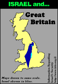
Comparison of the UK (in white) and Israel and the West Bank (in blue). The West Bank is the size of Dorset, a county (region) in the UK.
Two State Solutions
For instance: When the Muslim people living in India fought for their own (Muslim) state the British Government decided that a two state solution would prevent a civil war. There was to be a Muslim state and a Hindu state. in other words two countries based on religious belief. This process, which happened in 1947, was called Partition.
The British ceded the area now known as Pakistan, a huge, vast area, and another large, but smaller area that was meant to be East Pakistan, as one Muslim state and India as the Hindu state.
However, Pakistan and East Pakistan are not contiguous. They are separated by a vast country, India, of which both the areas of Pakistan and East Pakistan originally formed a part. So of course the two state solution was geographically ungovernable as two countries (India and Pakistan West / East).
This tragic time ended up, instead, becoming a three state solution:
- India
- Pakistan,
- Bangladesh.
Look at the map of the region.
Eight million people died during this partition. Nobody really talks about it. Fourteen and a half million people were uprooted.
Not thousands, not tens of thousands, not hundreds of thousands. 14.5 million moved from one state to the other and 8 million died trying to move in 1947.

The disputed territory of Kashmir between the border of India and Pakistan is huge, 222,000 sq km, the size of the UK
Of course if anybody bothered to look they would also find that Gaza and the West Bank are not contiguous.
- Maps can be made showing geographical features such as valleys and mountains, oceans and lands.
- Maps can be made showing political features, the borders and countries of the world.
- Maps can be made showing population features, density of humans or other species of interest.
- Maps can be made showing epidemiological features, the spread of diseases or traits.
- Maps can be made of economic features showing the distribution of wealth or trade or tourism.
- Maps can be made showing linguist features, the distribution of languages.
- Maps can be made showing religious distributions or political-religious distributions as some countries are theocracies.
All countries have some theocratic history to them, when they were mainly one religion or another. Some have remained theocratic. My map, below, shows a religious distribution to the best of my colouring in abilities.
Unlike the man from Lebanon trying to find his mother’s house on a world map, you cannot see yourself on a map of the world. You are not the centre of all worlds. You are only the centre of your own selfie.
Maps give us perspective.
I think, in a world of platitudes and political decisions by people who have no idea where we are talking about, or what we are talking about, we need to look at maps.
Here is a map of the world (minus the Artic and Antarctic):

The countries in Red are predominantly Christian.
The countries in Green are predominantly Muslim.
The countries in Purple are predominantly Buddhist.
The countries in Yellow are predominantly Hindu.
The countries in Blue are predominantly Jewish.
A little perspective goes a long way.
